MetaFise — more than physiotherapy

MetaFise was born from the desire to go beyond physical treatment — it’s a brand created by people, for people. From the very beginning, the focus has always been on placing each person at the center, respecting individuality and the different needs everyone brings.

This idea is clearly reflected in the visual identity. The symbol of the logo brings together three key elements:

  • The letter M, for MetaFise, which gives the logo its base shape.
  • A mountain, as a metaphor for the challenges and obstacles we all face and overcome.
  • A human figure, representing care, closeness, and a truly personal approach.


Share the Post:

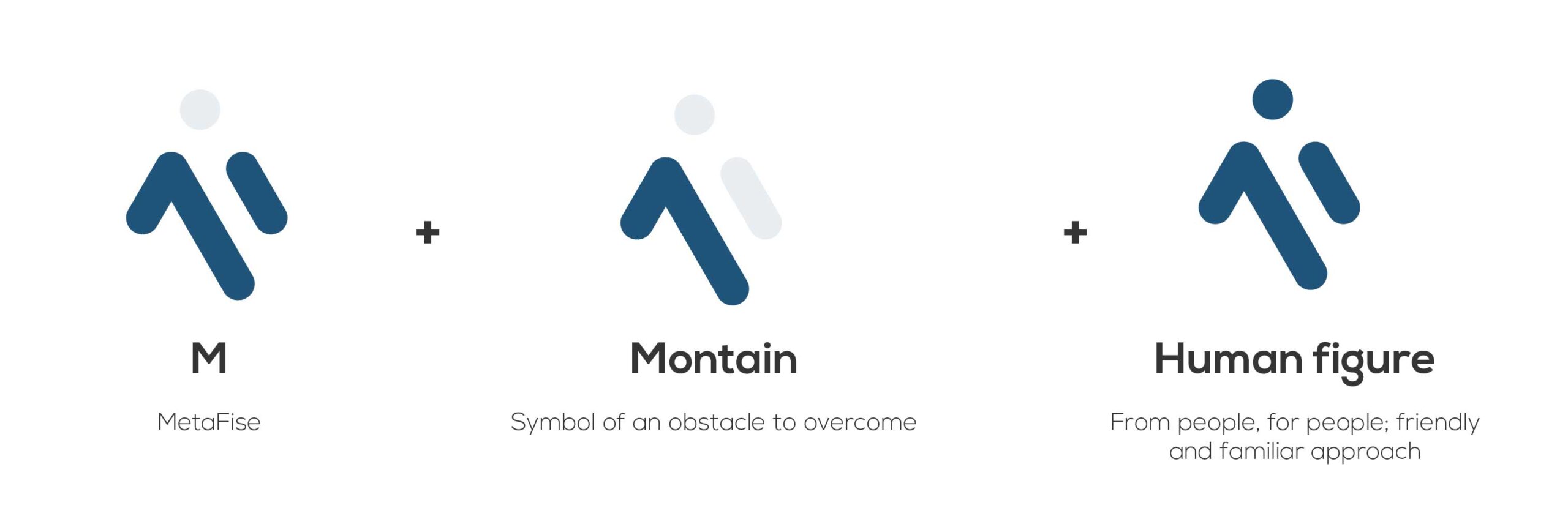
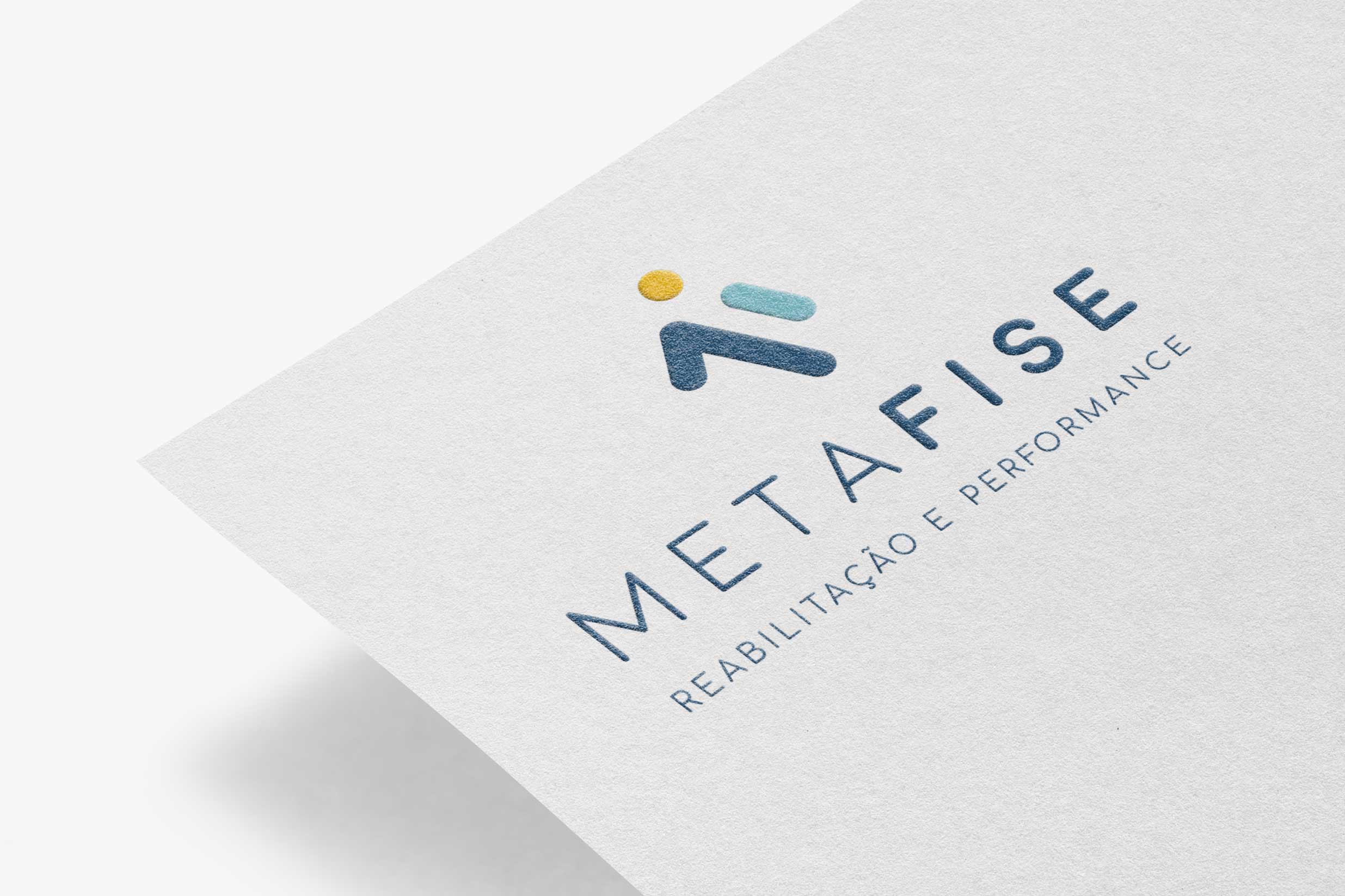
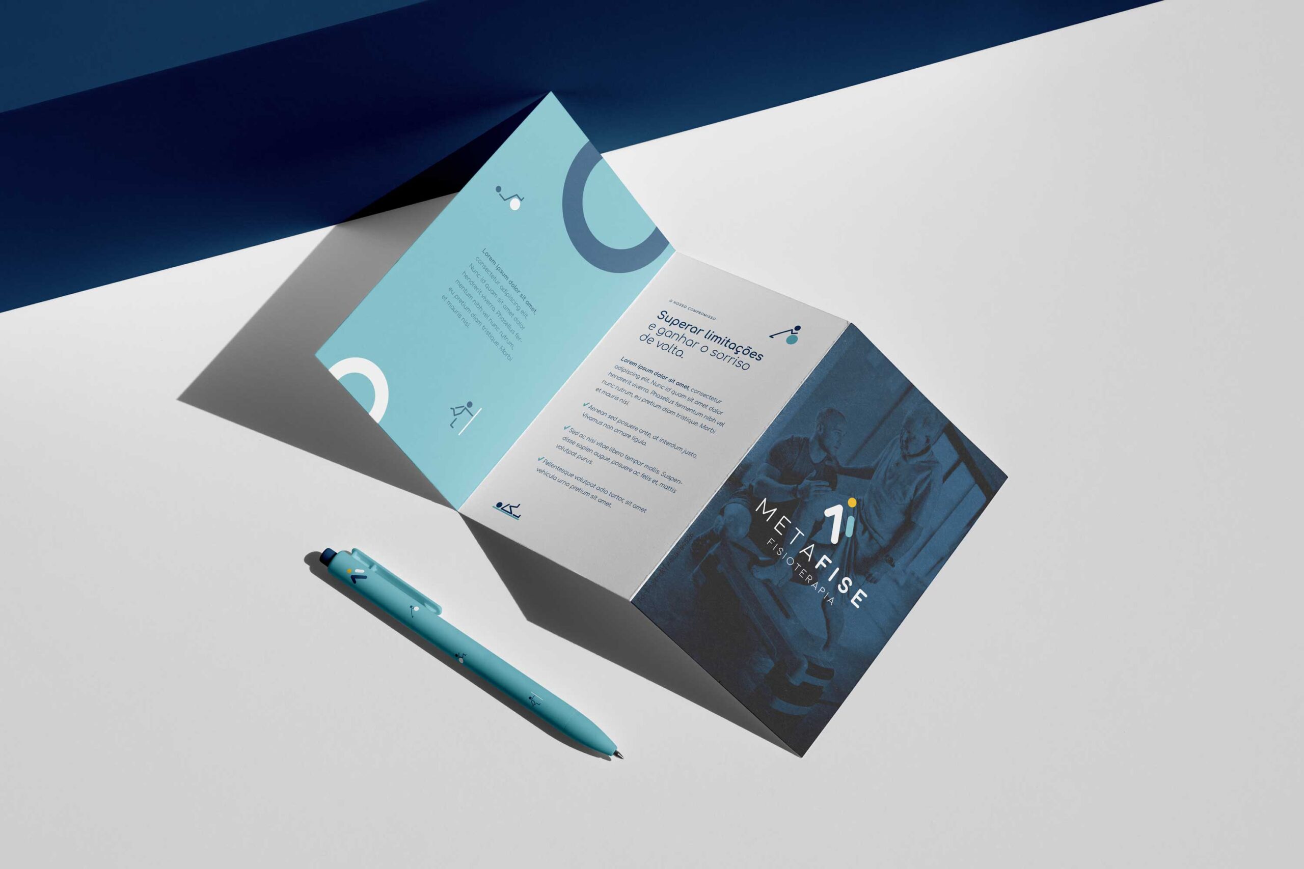
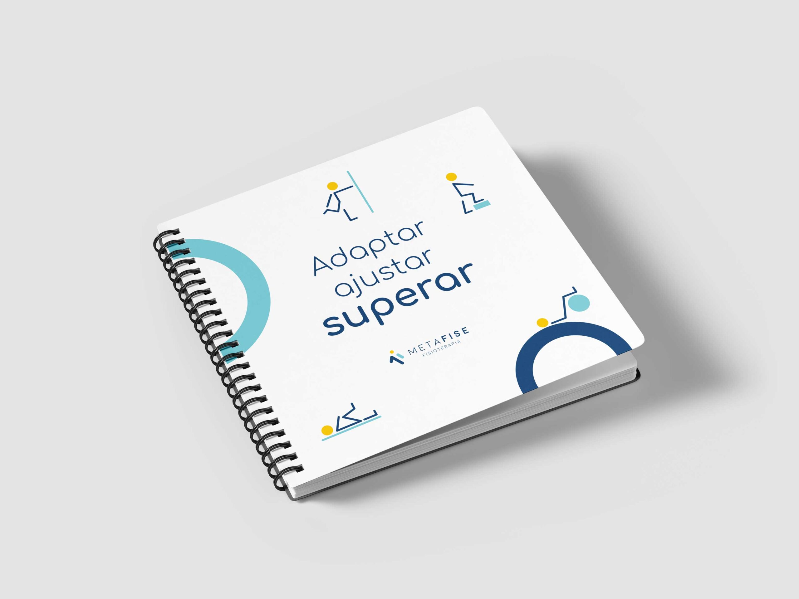
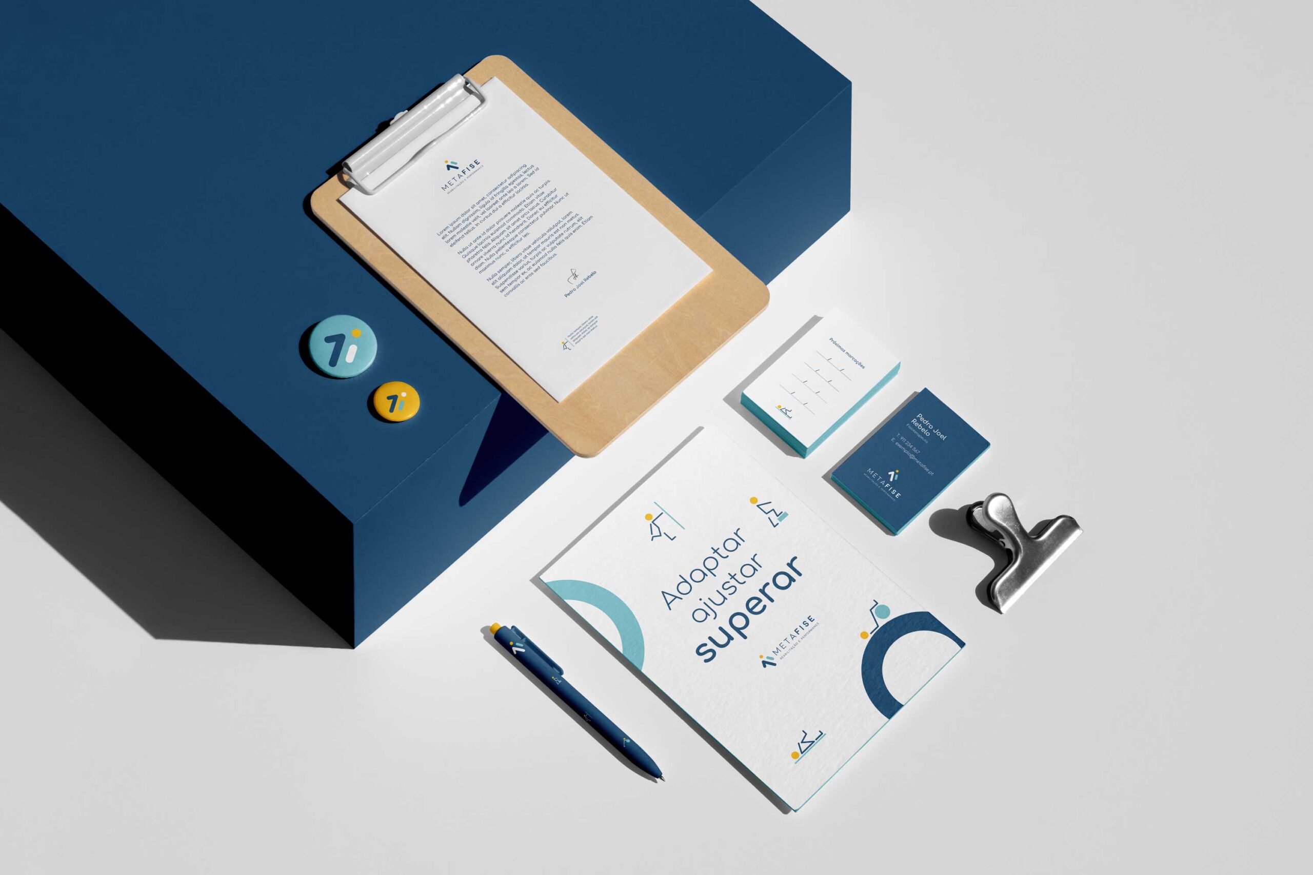
MetaFise is more than physiotherapy — it is a brand created by people, for people. The challenge was to turn this vision into a visual identity that conveys positivity, simplicity, and a friendly approach, while maintaining professionalism and trust.

The client wanted a brand that reflects MetaFise’s purpose: supporting people in overcoming limitations and rediscovering the joy of living.

The result is a clear and approachable identity that positions MetaFise as a positive, people-centered brand.

LAYOUT GRID
CONCEPT AND MEANING

The logo unites three elements: the letter M of MetaFise, a mountain as a metaphor for challenges, and a human figure symbolizing care and closeness.

VISUAL ELEMENTS

The graphic elements are more than decorative, they are a tool that makes communication clearer, more distinctive, and more engaging. These illustrations take the form of simple icons that represent some of the exercises commonly practiced in physiotherapy sessions.

Applied with space and rhythm, they bring dynamism and fluidity to the different communication materials, while keeping the visual language consistent with the MetaFise identity.

Through these icons, we highlight the physiotherapy service in a way that is both accessible and impactful, helping the brand connect more directly with its audience.

This project shows how design can turn a service into a clear and memorable visual language — resulting in a brand that communicates with simplicity, consistency, and impact.

join the success

Want to work together?
Your brand transformation begins here!

Fill out the form below, and I’ll get back to you within 1–2 business days. Let’s start crafting a brand you’ll be proud of!